
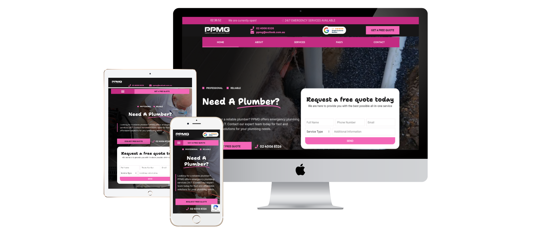
A contact form seems like a small detail until it costs your business an enquiry. A potential customer in Hobart may find your website on a phone between appointments, start typing, then leave when the form becomes frustrating. That lost conversation is often invisible in your analytics.
Here is a practical way to make enquiry forms easier to complete for more customers, including people using assistive technology. The ideas apply to trades, professional services, accommodation, retail and other Tasmanian businesses.
Start with the question your form needs to answer
If your goal is to arrange a callback, do you really need a street address, budget, company size and five dropdown menus? Usually not. For an initial enquiry, a name, one contact method and a brief message may be enough. Ask for additional details when they become relevant.
A Hobart roofing company might ask for the suburb and a short description of the roof problem. A graphic design studio might ask for the type of project and preferred contact method. Different services have different needs; copy the logic, not a generic form template.
1. Use clear labels and explain required fields
Put a visible label next to every field. “Email address” is clearer than an unlabeled box with placeholder text that disappears as the visitor types. Mark required fields consistently and explain what “required” means.
Do not make customers guess whether a field expects a mobile number, a postcode or a date. Include examples only where they help. If you ask for an Australian phone number, make sure the field accepts the formats your customers actually use.
2. Choose a layout that works on a phone
Test the form on a narrow screen, not just in the desktop website builder. Single-column fields are usually easier to follow. Keep tap targets comfortable, avoid tiny text, and make the submission button easy to identify. When a mobile keyboard opens, the current field and any error message should remain usable.
Visitors should be able to finish the enquiry without horizontal scrolling. If the form requires an attachment, explain acceptable file types and sizes before someone tries to upload.
3. Explain errors so people can fix them
“Invalid input” is rarely enough. Say what needs attention: “Enter an email address such as name@example.com” or “Choose a preferred contact method.” Place the message close to its field, and do not rely on red colouring alone.
Keep the visitor’s other answers when validation fails. Nobody wants to retype a detailed job description after mistyping a phone number.
4. Make keyboard and screen-reader use practical
Try completing the form using only the Tab, Shift+Tab, Enter and Space keys. Can you reach every field, understand where focus is and activate the submit button? Labels, grouping and error announcements also matter for screen-reader users.
The W3C Web Accessibility Initiative form tutorials explain labels, instructions, validation and feedback. Australia’s business.gov.au accessibility statement also identifies WCAG 2.2 AA as its benchmark. These are useful references when improving your own customer journey.
5. Give a trustworthy privacy explanation
Customers should know why they are sending their details and what will happen next. Link to a clear privacy policy, avoid requesting sensitive information you do not need, and do not make unrelated marketing consent a hidden condition of an ordinary enquiry.
For example: “We use your details to respond to your enquiry. See our privacy policy.” The exact wording should reflect your real practices and applicable obligations, not a generic claim pasted from another business.
6. Show confirmation and test delivery
After submission, provide a clear success message so the customer does not press the button repeatedly. If you promise a response time, make sure your business can meet it. A form that appears to work but sends no notification is worse than a visible error.
Every month, submit a test enquiry from a different device. Check that it reaches the correct mailbox, that attachments arrive where relevant, and that staff know how to follow up. Treat the test message as a real customer journey.
7. Keep alternatives available
Some people prefer to call; others cannot conveniently use the phone. A website should make suitable alternatives easy to find—an email address, contact form, telephone number or booking link according to your business model. Make contact details consistent across your site.
For service providers, a thoughtfully designed contact page can reduce repeated questions and simplify enquiries. If the overall experience needs work, explore DanSol’s web design services in Hobart.
A 20-minute form audit for your business
- Open your contact page on a phone and submit a real test enquiry.
- Remove any field that is not needed for the first conversation.
- Check every label and required-field instruction.
- Trigger an error deliberately and confirm you understand how to fix it.
- Tab through the entire form using a keyboard.
- Check the confirmation message and inbox delivery.
- Ask somebody unfamiliar with your website to repeat the test.
Common questions
How many fields should a business contact form have?
There is no universal number. Keep only what you need to handle the first request. A simple callback form and a detailed service quote form may reasonably ask different questions.
Is a CAPTCHA always necessary?
Spam protection can be useful, but choose a method that does not make legitimate customers solve unnecessarily difficult challenges. Test whichever approach you use with keyboard and assistive-technology workflows.
Will improving a form automatically increase enquiries?
Not necessarily. Better usability removes obstacles, but enquiry volume also depends on traffic quality, your offer and customer demand. Measure successful submissions and the quality of enquiries rather than assuming every redesign works.
Make the next enquiry easier
If customers struggle to contact your business, improving a few form details may be a better first investment than adding another homepage animation. DanSol supports Tasmanian businesses with website and digital services. Start by testing your current experience, then prioritise the changes that make it easier for a real customer to get in touch.